








The Web Design Formula for Fiberglass Pool Companies

A homeowner can like the shape of a fiberglass pool and still have no idea whether it belongs in their backyard. They may be wondering where the steps would sit, how much room would remain for a patio or who would handle the work around the pool after the shell arrives.
A website that shows a model name, a small outline and a “Request a Quote” button leaves those questions for someone else to answer. A useful website connects the product to the finished space, then explains how the company will help the homeowner get there.
That is the formula: make the pool understandable, make the backyard imaginable and make the next conversation feel worthwhile. For fiberglass pool builders, dealers and installation companies, each part deserves a deliberate place in the design.
Why a fiberglass pool website needs a different approach
A visitor looking for an emergency plumber usually has a defined problem. A prospective pool buyer is often still working out what they want. Their questions move between product selection, property constraints, investment and the experience of owning the finished backyard.
The business also has to explain several layers of responsibility. A manufacturer may produce the shell, a dealer may supply the range and an installer may manage the site work. Some companies coordinate the entire project, including paving and outdoor living features. Others work within a narrower scope. The website should make that distinction clear before a visitor assumes everything in a photograph is included.
Fiberglass adds another important design consideration. The homeowner is usually choosing from an established range of pool shapes and sizes while making decisions about the surrounding space. Product browsing and backyard planning therefore need to work together.
A shell diagram helps someone understand the steps and seating. A completed installation shows how that same pool can sit beside a dining terrace, lawn or garden. Neither replaces the other. The strongest websites let homeowners move between both views without losing their place.
Give the website a structure that follows the buying journey
Begin with the questions a homeowner needs answered, then assign each question a clear destination. A practical main navigation might include:
- Pools, with a browsable collection and individual model pages
- Our Projects, showing completed installations
- The Process, explaining the company’s responsibilities and project stages
- Planning Your Pool, covering cost, finishes and common decisions
- Service Areas, showing where the company works
- About and Contact, with the people and details behind the business
These are suggested labels, not a required menu. A dealer that also sells spas may need a separate product category. An outdoor living company may need to explain pergolas and landscaping alongside pools. The important point is to make each section understandable without knowing the company’s internal terminology.
Connect these destinations within the pages themselves. A model page should lead to installations using that model. A project page should identify the pool and link back to its specifications. A cost article should explain which factors a consultation will resolve.
Consider a visitor who arrives through a search for a compact fiberglass pool. They should be able to inspect suitable models, see a completed smaller backyard and ask whether their property could accommodate a similar arrangement. Sending every visitor back to the homepage interrupts that path.
Make the hero section specific enough to establish fit
The hero needs to answer three questions quickly: what the company offers, where it works and what the homeowner can do next.
“Your Dream Backyard Starts Here” communicates an aspiration but says little about the business. An illustrative alternative is: “Fiberglass pools and complete backyard installations in the northern suburbs.” A supporting sentence could explain that the team helps with model selection, installation and the surrounding patio, if those services are actually included.
Pair this positioning with a strong photograph of a completed setting. Keep the pool visible in the mobile crop and place text where it remains legible. A headline over pale paving may need a different position from the same headline over shaded foliage.
Use a primary action that matches the likely visitor’s intent. “Explore pool designs” is useful for someone starting research. “Plan your pool consultation” suits someone ready to discuss a property. A secondary link to completed projects gives visual browsers another route.
The first screen does not need a video, a financing offer, a promotion and three competing buttons. It needs a coherent explanation of the company and a sensible starting point.
Show the finished lifestyle, then explain the product
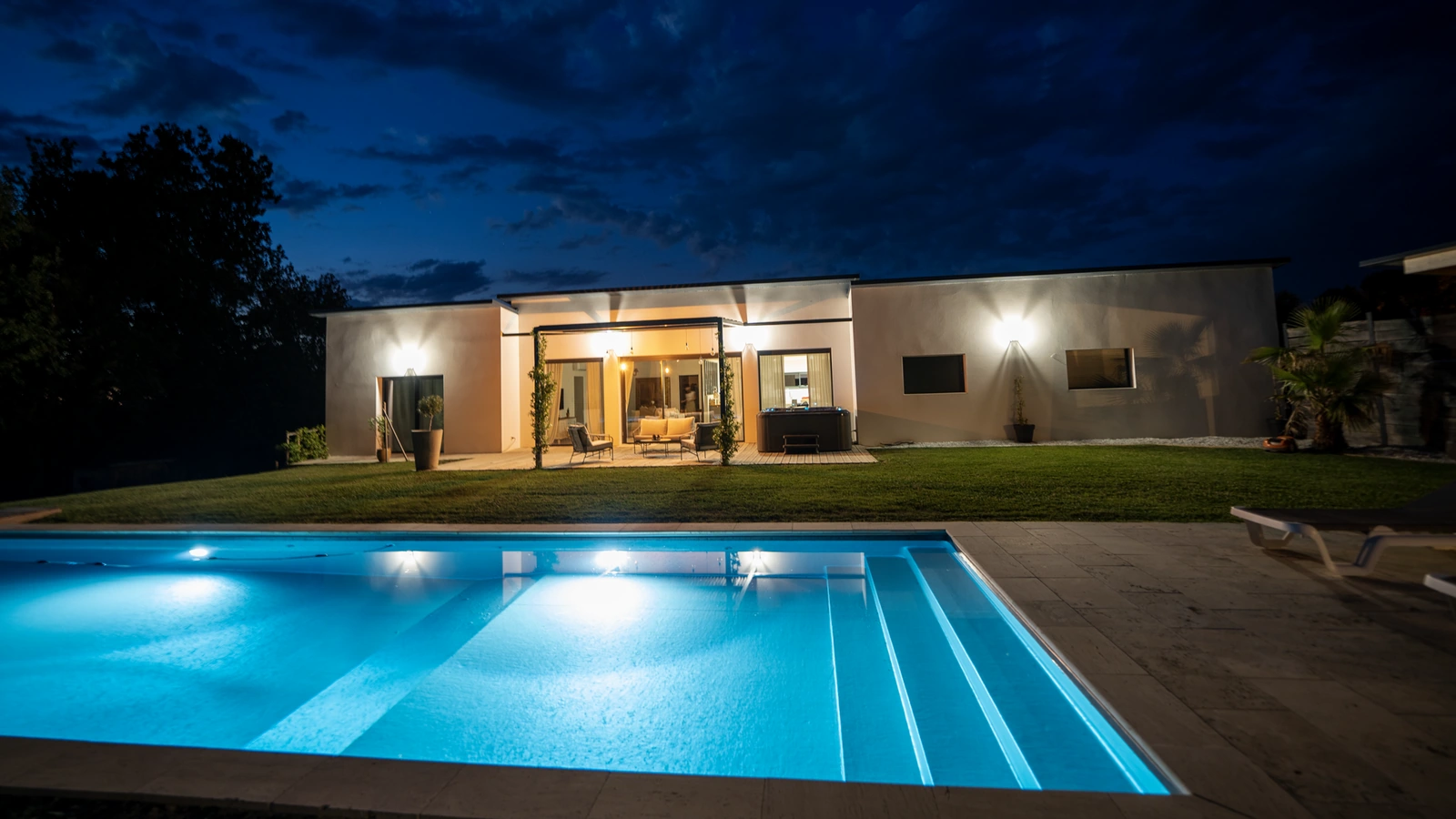
Photography should help a homeowner understand how the space will be used. Include views that show the relationship between the pool and the house, the circulation around the water and the places where people will sit or gather.
A close view of the water can establish atmosphere. A wider view explains the layout. An overhead view can reveal how a pool, spa and deck fit into a constrained site. Together, those images tell a more useful story than a sequence of almost identical water-level photographs.
Choose examples that reflect the work the company wants to undertake. A builder specializing in compact suburban sites should show those spaces prominently. A company offering larger outdoor living projects can show how the pool connects with entertaining areas and planting.
Keep shell photographs and product renders available where they help explain the range. Label renders as renders and manufacturer imagery as manufacturer imagery. Do not present an attractive supplier photograph as proof that your own team completed the installation.
At Anika Labs, this connection between identity and presentation informed our work with ModernXPools. The brand and website needed to give completed pools, spas and outdoor living spaces a consistent setting. The broader lesson is useful for any pool company: the visual identity should support the work homeowners came to inspect.
Build a pool collection that is easy to browse
A collection page should help a homeowner narrow the field before asking them to study detailed specifications.
Give each model a consistent card with its name, a clear image or plan, its published dimensions and a short description of the layout. Descriptions should identify meaningful differences. “Rectangular layout with a generous entry ledge” is more useful than repeating “the perfect pool for your family” across the range.
If the range is substantial, start with a few understandable filters such as approximate size, shape and a particular feature. Do not open with a wall of technical attributes. A small range may need no filters at all, just well-organized cards.
Explain unfamiliar features in ordinary language. A tanning ledge should be identified on a plan and shown in a real installation. Built-in seating should be located clearly. A feature name alone does not tell someone how much swimming space remains.
Give every model a useful individual page
A model page should stand on its own when a visitor arrives directly from search or a shared link. Include the model’s name and manufacturer, the available sizes, a readable plan and photographs that show the same model installed.
Use current manufacturer specifications rather than reconstructing measurements from an image. Latham’s fiberglass pool range, for example, organizes models around their shapes and sizes and notes that published measurements can vary. Your own pages should carry the correct specifications and qualifications for the range you actually sell.
Distinguish dimensions from usable space. A listed length does not explain the position of the steps, benches or ledges. If a measurement describes the outside of the shell rather than the internal swimming area, say so. Depth information also needs a clear basis, especially when shell depth and operating water depth differ.
A concise specification table can organize the practical questions:
| Homeowner question | Information the page should provide |
|---|---|
| How large is it? | Published length and width, units and the measurement basis |
| How does the depth change? | The stated depth range and a profile or drawing where available |
| Where are the steps and seats? | A labeled plan supported by installation photographs |
| Which choices are available? | Supported finishes, options and model-specific restrictions |
| What still needs checking? | Site access, placement and installation feasibility assessed by the installer |
Avoid presenting a pool outline as a guarantee that it fits a particular property. The shell is only part of the site assessment. The website should help someone prepare for that discussion without pretending to replace it.
Help people compare a shortlist without overwhelming them
Comparison is most useful after a visitor has found two or three plausible options. Let them save a shortlist or open a small comparison view using the same information for every model.
Compare dimensions, depth profile, shape and the position of major features. Keep drawings at a common scale where practical. Otherwise, two plans can appear equally large even when the published dimensions differ substantially.
Explain the trade-offs in prose. Suppose a homeowner is comparing two rectangular models. One may reserve more space for an entry ledge while the other provides a more open swimming area. A short explanation of that difference helps more than another row of icons.
Do not rank one model as universally better. Suitability depends on the property and the household’s priorities. A useful comparison ends with an invitation such as “Discuss these models for my backyard,” carrying the selected model names into the enquiry.
On a phone, avoid forcing the visitor to pan across an enormous spreadsheet. A stacked comparison or a small set of expandable attributes is easier to inspect. Keep the model names visible so the visitor always knows which information belongs to which option.
Present colors and finishes as real materials
A tiny colored circle cannot explain how a finish may look across a filled pool. Show the named finish, a close view of the surface and an example of its appearance in an installation where suitable imagery is available.
Keep the selected finish name visible when a swatch changes. Make the interaction usable by keyboard and provide text labels so visitors do not have to distinguish choices by color alone.
Treat a digital preview as a guide. Light, water depth, surroundings and the display itself can affect the appearance someone sees. Latham’s color selector explicitly describes digital images and swatches as representational. A dealer’s website should be equally clear about the limits of a screen preview.
For example, a homeowner interested in a pale finish could move from the swatch to photographs of completed pools using that finish, then ask to see a physical sample during consultation. That is a more credible path than implying a rendered image guarantees an exact result.
Show which finishes are available for the selected model and identify any supplier or availability limitations. If changing a finish affects an indicative price, explain the basis rather than silently changing a number.
Turn the project gallery into evidence
A gallery should help visitors evaluate the company’s work, not simply keep them swiping.
Organize photographs into projects where possible. Give each project a short explanation of the homeowner’s goal, the pool model or dimensions where known and the work the company completed. General location information can establish local relevance without publishing a customer’s address.
A compact courtyard project might explain how the layout retained room for a dining area. A larger installation might show the relationship between the pool, an existing terrace and a separate spa. Those details help a prospective customer recognize a situation similar to their own.
State the company’s scope accurately. If another contractor completed the landscaping, credit that contribution rather than implying a single team delivered everything in the photograph. Obtain permission to publish customer images and details.
Use before-and-after content when it explains a decision
Before-and-after images are useful when the change needs explanation. They can show how an awkward garden became a connected outdoor space or how an existing patio influenced the pool’s position.
Use comparable viewpoints and identify what changed. A photograph of an excavation followed by a polished evening shot is less informative than a short sequence showing the original space, the main installation stage and the completed layout.
An interactive slider is optional. Two labeled images often communicate the same information with less friction on mobile. The important content is the decision behind the transformation, not the effect used to reveal it.
Explain the installation journey and the company’s responsibilities
Homeowners need to understand what happens after they express interest. A process page should reduce uncertainty about decisions, responsibilities and communication.
Begin with the consultation: what the team will discuss, whether there is a charge and which information helps prepare. A property location, approximate goals and a few photographs may be enough for an initial conversation. Explain when a more detailed site assessment is needed.
Then describe how the company moves through site assessment, design and model confirmation, proposal approval, necessary approvals, ordering and scheduling. Continue through site preparation, delivery and installation, the agreed surrounding works, commissioning and handover. The exact sequence should reflect the company’s operating model.
A dealer should identify who installs the pool. An installer should explain whether paving and electrical work are coordinated within the project or arranged separately. If different specialists are involved, explain who the homeowner contacts when a question arises.
Set expectations without promising a universal timeline
Separate installation activity from the overall project schedule. A pool shell being positioned is one milestone; a finished backyard may depend on other work and decisions.
Explain the factors that can affect scheduling, such as approvals, site access, ground conditions, supplier availability and weather. If publishing an estimated duration, identify what it covers and when the estimate is confirmed.
Handover deserves its own explanation. Homeowners should know what operating guidance they receive, where warranty documents come from and how to request support. A confident ownership experience begins before the first enquiry, with a website that explains what support actually includes.
Discuss investment and financing with enough context to be useful
A homeowner asking about cost is usually trying to establish whether a project is realistic. Responding only with “every backyard is different” avoids the question without helping them prepare.
Explain the main components of an investment: the pool and selected options, site preparation and access, installation, equipment and the agreed work around the pool. Identify which items the company normally includes and which may be quoted separately.
If the business can publish representative ranges, date them and define their scope. A shell-only price and a completed installation price are different figures. A project example can be particularly useful when the scope, exclusions and factors affecting the final price are clear.
Avoid an impressive starting price that depends on conditions most customers will not meet. A calculator can help explain options but should state its assumptions and show when a site assessment is required. It should also remain usable without surrendering contact details just to discover what the estimate means.
If financing is offered, identify the provider and link to its current terms. Make eligibility and any conditions clear beside the offer. Do not make a monthly payment the main price reference while hiding the project cost or the basis of the repayment example.
The website’s role is to explain the commercial conversation accurately. It should not make a visitor believe that a planning estimate is a confirmed quotation.
Make service areas specific and credible
A homeowner should be able to establish whether the company serves their property without completing a form first. Show the main operating area in prominent copy and provide a service-area page with recognizable place names.
Where the company has enough relevant information, individual location pages can answer local questions. Include completed work in that area, the services available there and practical information that the team can substantiate. A project in a nearby town may be more persuasive than a generic claim to cover an entire region.
Be precise about physical locations. A company can serve a town without having an office there. Separate a showroom address from the wider installation area and keep contact information consistent.
Do not create dozens of near-identical town pages with only the place name changed. Google identifies substantially similar pages that funnel visitors toward another destination as a possible form of doorway abuse. Build pages because they answer distinct local questions, not because a spreadsheet contains another town name.
Put trust signals beside the decisions they support
Trust is easier to assess when evidence appears in context. A review describing communication during installation belongs near the process explanation. A completed project belongs beside the model it uses. Warranty information belongs where someone evaluates the product and installation responsibilities.
Use reviews with a clear source and enough context to be meaningful. Link to the original review platform where appropriate. Present permissions, memberships and manufacturer relationships accurately and keep them current.
Explain the difference between a manufacturer’s product warranty and any installation workmanship commitment. Link to the applicable documents and make the company’s own responsibilities clear. Avoid compressing different promises into an unsupported “lifetime guarantee” badge.
Introduce the people who will handle enquiries and projects. Real team information, a working telephone number and a clear explanation of aftercare can answer questions that a row of generic trust icons cannot.
The goal is not to fill the page with reassurance. It is to give a homeowner enough specific evidence to judge whether the business can deliver the kind of project being shown.
Give every page an appropriate next step
Repeating “Request a Quote” after every section can make the website feel demanding, especially when a visitor is still learning which pool they want.
Match the action to the page. A collection page can invite visitors to explore models. A finish page can suggest discussing samples. A project page can offer a conversation about a similar backyard. A model page can invite the homeowner to check suitability for their property.
Use direct labels and explain what happens next. “Arrange a pool consultation” becomes more useful when the adjacent copy says the team will discuss the property, preferred models and intended scope before recommending the next step.
Carry useful context into a short enquiry
A consultation form should preserve the model or project that prompted the enquiry. Ask for the details the team needs to respond, such as a name, contact method, property area and a brief description of the plan. Budget and timing questions can help qualification when their purpose is clear and sensible “not sure yet” options are available.
Do not require a homeowner to upload plans they may not have. Offer photographs or additional details as optional inputs when they are useful. Keep labels visible, explain errors clearly and show a confirmation that states what the person can expect.
Behind the form, route the enquiry to someone responsible for following up. Test notifications and the acknowledgement message. A premium-looking website loses its value if a well-qualified enquiry disappears into an unmonitored inbox.
Make the mobile experience work during real research
Pool research does not happen only at a desk. Someone may open a model page from a message, compare it with a photograph of their garden or return to a saved project while speaking with a partner.
Keep the main navigation compact and make model information easy to read without zooming. A specification drawing needs a larger view when its labels are small. A finish selector needs comfortable controls and an obvious selected state.
Let photographs open larger without trapping the visitor in a gallery. Provide an identifiable close control and preserve their position when they return. Avoid interactions that depend on hovering over an image.
Check that a sticky contact button does not cover specifications, consent controls or the form itself. Test the page with the phone keyboard open. The visitor should still be able to see the field they are completing and the next action.
These details are part of website design and interface planning, not finishing touches added after desktop approval. Review a real browsing sequence on a phone: discover a model, inspect its plan, view a completed project and begin an enquiry.
Keep a photography-heavy website fast
Large pool photographs can communicate quality, but sending every original file to every device creates unnecessary work for the browser.
Prepare image sizes for the places they appear. A small model card does not need the same file as a full-screen project photograph. Use modern formats where suitable and responsive image delivery so a phone can receive an appropriate version. web.dev’s responsive image guidance explains how image candidates help browsers choose a suitable resource.
Give images width and height information so the layout can reserve their space. Load gallery images below the initial viewport as they approach view, but make the main visible image available promptly. In particular, avoid lazy-loading the page’s largest visible hero image, as explained in web.dev’s guidance on optimizing Largest Contentful Paint.
Use video selectively. A large autoplay background can compete with the information someone came to inspect. A still image with an optional play control may suit an installation explanation better than several simultaneous motion effects.
Image handling, reliable forms and a maintainable product structure are practical website development responsibilities. Anika’s Website Performance & Core Web Vitals Guide provides a broader framework for reviewing performance. Test important pages under ordinary mobile conditions as well as on the office connection.
Build SEO around distinct homeowner questions
A pool website needs pages that answer different kinds of searches. The collection introduces the range. A model page explains a particular product. A service-area page establishes local fit. Educational content helps someone make a decision before choosing an installer.
Give each indexable page a descriptive title, a clear main heading and substantive content that matches its purpose. Keep important model information available as readable page text rather than hiding it entirely in an image or brochure download.
Link related pages naturally. A model page can point to its available finishes, an installation using that model and the consultation process. A project can lead back to the product. An article about pool costs can explain which choices affect scope and where to discuss a specific property.
Use descriptive image filenames and alt text that explains the image’s relevant content. Do not turn every image description into a string of town names. Google’s image SEO guidance emphasizes the surrounding page context as well as image information.
Publish educational content that helps someone decide
Cost, installation, maintenance and material comparisons are useful subjects when the answers come from the company’s actual experience and current product information.
A cost guide can explain what the quotation includes and why access changes a project. An installation article can show how scheduling works. A maintenance guide should follow the relevant manufacturer’s instructions rather than repeat a universal promise that fiberglass requires no care.
A comparison of fiberglass, concrete and vinyl should explain the trade-offs the company can support, including product choice, construction approach and ongoing ownership considerations. Be clear about the products the business sells. Readers can still trust a specialist that acknowledges where another approach may suit a different brief.
Choose specific questions over interchangeable article titles. “What information do we need to assess access to your backyard?” can support a real consultation. An article repeating “fiberglass pools in our area” adds little if it never answers a homeowner’s next question.
Coordinate this work with the business’s SEO and growth strategy. Check which pages attract relevant enquiries and update information when the range, operating area or installation process changes. Publishing more pages is useful only when those pages do a distinct job.
Make the website feel premium through clarity
A premium pool website needs strong photography, consistent typography and enough space for the product to be understood. It does not need decorative effects on every screen.
Use a restrained visual system across model cards, specification tables and forms. Keep text contrast comfortable and body copy readable. Make selected states and controls obvious. Avoid enlarging photographs on hover when the effect adds no useful information.
Branding should connect the logo, tone of voice and visual presentation across the website and the materials a homeowner receives afterward. Anika’s creative and branding work brings those elements together; for a pool company, consistency should continue into brochures, proposals and handover information.
The same principle runs through our article on what makes a website look expensive: quality comes from considered decisions throughout the experience. A beautifully arranged homepage cannot compensate for unreadable plans or an unfinished enquiry form.
Review the path from browsing to consultation
Before commissioning a redesign, choose a small set of realistic tasks. Ask someone unfamiliar with the range to find a suitable model, explain its key features, locate a completed installation and describe what happens after making contact.
Watch where they hesitate. If they cannot distinguish two models, improve the comparison. If they assume the photograph shows a standard inclusion, clarify the scope. If they cannot tell whether the company serves their town, make the operating area easier to find.
Measure completed enquiries alongside the actions that precede them. Model views, project visits and consultation starts can help identify friction, but they are not the same as a useful sales conversation. Review lead quality with the team handling follow-up rather than judging the website only by traffic or button clicks.
A fiberglass pool website succeeds when the homeowner can move from “I like that pool” to “I understand how this company could help with our backyard.” Clear products, credible completed work and an understandable process make that movement possible. The design should make the next conversation easier for both the homeowner and the business.