








- →Premium perception is not an accidental aesthetic; it is the mathematical result of strict spatial rhythm, optical margin alignment, and typographic discipline.
- →High-value brands avoid visual noise and trend-chasing, relying instead on sophisticated neutral palettes, bespoke art direction, and generous negative space.
- →Micro-interactions governed by natural spring physics signal meticulous engineering craft that prospective clients extrapolate to product quality.
- →Executing these 12 micro-design principles creates commanding pricing power that allows companies to win high-margin enterprise contracts.
Why does one digital product command $100,000 enterprise contracts with effortless authority, while a direct competitor offering identical functional software struggles to close $500 monthly subscriptions?
The difference is rarely found in feature matrices or technical capability. The difference is found in perceptual economics: the instinctive, instantaneous assessment of quality, reliability, and institutional security that prospective buyers form the second they interact with an interface.
In consumer luxury, physical weight, tactile textures, and subtle acoustic feedback signal premium craft. In the digital realm, where every product is rendered on the same flat glass screen, premium perception is engineered through microscopic visual mathematics: optical typography, spatial restraint, harmonious contrast ratios, and physics-driven micro-interactions.
The Visual Economics of Premium Perception
Extensive research published by Nielsen Norman Group on visual hierarchy and credibility demonstrates that visual aesthetics directly influence perceived usability and brand trustworthiness. When an interface looks refined, users instinctively presume the underlying technology is secure, robust, and worth premium pricing.
Conversely, minor visual inconsistencies: mismatched button padding, misaligned margins, clashing font weights, and jarring animations signal carelessness that prospective clients instinctively extrapolate to your corporate competence.
The 12 Micro-Design Principles of High-End Digital Products
Examine the twelve disciplined craft decisions that separate luxury, high-trust digital experiences from generic web pages:
1. The 8-Point Spatial Grid Discipline
Inexpensive websites eyeball padding and margins arbitrarily, using 15px here and 23px there. High-end digital systems anchor every component, margin, padding value, and gap strictly to multiples of 8 pixels (8, 16, 24, 32, 48, 64, 96, 128). This mathematical consistency creates an underlying visual harmony that the human brain recognizes as orderly and calm.
2. Optical Alignment Over Pure Geometric Alignment
Computers calculate bounding boxes geometrically; human eyes calculate visual weight optically. For example, a play icon inside a circular button must be shifted slightly right of geometric center to look balanced. High-end design teams manually adjust optical baselines and tracking values to achieve visual perfection.
3. Modular Typographic Scales and Line-Height Restraint
Amateur sites use too many font sizes that clash clumsily. Luxury interfaces adhere to a strict modular scale (such as a Major Third or Perfect Fourth ratio). Furthermore, as headline font sizes grow, line-height must decrease proportionally: a 64px display headline requires a tight 1.05 line-height, whereas 16px body copy demands a comfortable 1.6 line-height for effortless legibility.
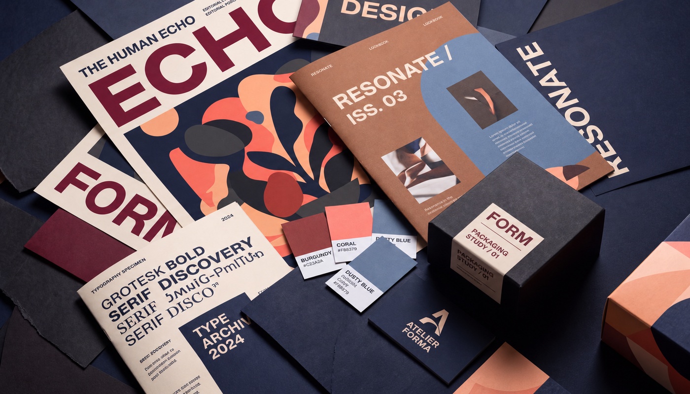
4. Bespoke Editorial Art Direction Over Generic Stock Photos
Nothing cheapens a corporate website faster than sterile stock photography of people in suits grinning in glass conference rooms. Premium brands invest in bespoke editorial photography, custom 3D architectural renders, or disciplined abstract brand geometry that cannot be purchased for $10 on a stock image marketplace.

5. High-Value Sophisticated Neutral Palettes
Inexpensive designs rely on harsh primary colors and pure black (#000000) on pure white (#ffffff). Luxury digital aesthetics build depth using tinted neutral palettes: warm cream canvases (#f9f9f5), deep midnight navies (#0e1226), and slate charcoals that feel organic, rich, and easy on the eyes.
6. Extremely Low-Opacity Divider Lines and Borders
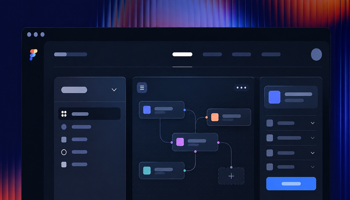
Harsh 100% opaque black or grey divider lines chop up layouts aggressively. High-end products use subtle, translucent borders (such as rgba(20, 26, 51, 0.08) on cream backgrounds or rgba(255, 255, 255, 0.08) on dark mode). The borders define spatial structure without competing for visual attention.
7. Spring Physics Micro-Interactions Over Stiff Linear Transitions
Cheap interfaces use rigid CSS transitions like transition: all 0.3s linear;, which feels robotic and dated. Premium interfaces simulate real-world physics using damped spring curves (such as cubic-bezier easing cubic-bezier(0.16, 1, 0.3, 1)). Buttons compress naturally on click and spring back with subtle, tactile inertia.
8. Intentional Negative Space (The Luxury of White Space)
Amateur stakeholders fear empty space and try to cram content into every pixel. True luxury is defined by space. Giving typography, imagery, and interactive elements generous room to breathe immediately signals confidence and high authority.
9. Subtle Grain and Noise Over Pure Flat Gradients
To combat sterile digital flatness, leading design studios layer subtle monochromatic film grain textures (between 2% and 4% opacity) over gradients and dark surfaces. This introduces physical tactile texture that evokes editorial print quality.
10. Multi-Layered Soft Ambient Shadows
Default CSS box-shadows (box-shadow: 0 4px 10px rgba(0,0,0,0.2)) look dirty and artificial. High-end design systems construct realistic ambient shadows using multiple stacked layers with low opacity and wide blur radiuses, mimicking natural ambient lighting.
11. Restrained Badge and Tag Geometry
Avoid garish, oversized pill badges with heavy saturated borders. Premium badges use concise uppercase tracking (letter-spacing: 0.12em), small font sizes (0.72rem to 0.78rem), and subtle 8px or 10px border radiuses that complement rather than overpower the surrounding content.
12. Contextual Content Staging and Reveal Sequencing
How content enters the viewport matters as much as how it looks at rest. Staggered reveal animations that gently slide elements upward as the user scrolls create a cohesive narrative journey that feels intentional and cinematic.
Frequently Asked Questions
Can an existing website be upgraded to look premium without a total rebuild?
Yes. By standardizing typography on an 8pt spatial grid, softening harsh borders to low-opacity RGBA values, replacing generic stock imagery with authentic editorial assets, and refining button hover physics, an existing interface can be elevated dramatically within weeks.
How does premium design impact customer conversion rates?
When enterprise buyers assess mission-critical software or consulting partners, perceived risk is the primary obstacle. A polished, high-trust digital presence removes subconscious friction, accelerating deal cycles and justifying higher contract values.
What fonts look most expensive for modern corporate brands?
High-end typography balances timeless editorial serif headlines (such as Instrument Serif or Season Serif) with clean, precision-engineered geometric sans-serif body copy (such as Plus Jakarta Sans, Inter Tight, or Neue Haas Grotesk).
The Strategic Recommendation
Perception is reality in enterprise commerce. You cannot sell a seven-figure service through a five-hundred-dollar aesthetic. Invest in the subtle mathematical details of design craft to establish undisputed category leadership.